Thursday
Jun212012

Lidia, il cielo cade - Maurizio Cogliandro
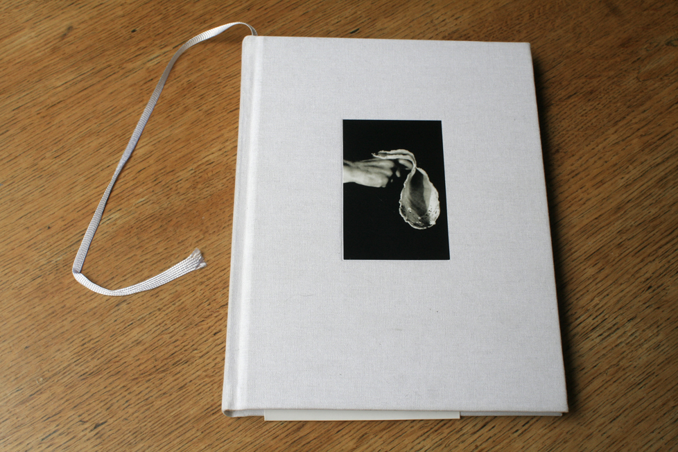


Maurizio Cogliandro - Lidia, il cielo cade

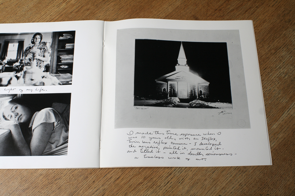
Lidia, the sky is falling. It does not happen often, but when it happens it is great. You take a photobook in your hands for the first time and, without opening it, you know it is a special book. It happened to me only a few times: with Children of Europe by David Seymour, the small ringbound paperback from 1949, with the yellow, imaginary band around the cover and the children's drawings on the back. It happened when finding A Dialogue with Solitude by Dave Heath, from 1965, with inside the blackest of inks showing an obscure tale of beauty and pain. With A Loud Song by Daniel Seymour, from 1971.  The title and it's typography, the image on the cover and the last picture of the book (which so often we see first) of the church, made when Seymour was 10 year old . . . it was all there.
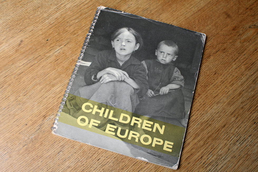
 

(David Seymour: Children of Europe, Unesco 1949)
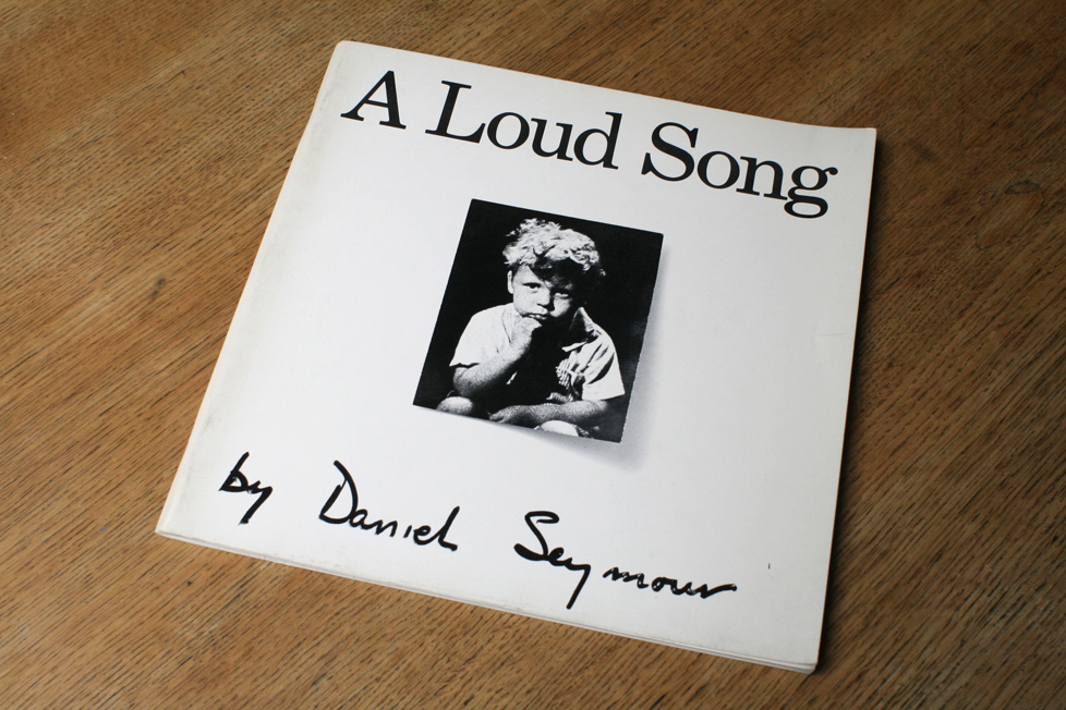
 

(Daniel Seymour: A Loud Song, Lustrum Press 1971) 

When, in the spring of 2010, I saw Maurizio's book first, it was from that 'first feeling' that I bought it right away. Contrary to what people believe of me, I do not buy many photobooks. I never have. It is just that over the many years I have constantly looked for and gotten, my favorites.

Lidia, il cielo cade is most of all a brave book because it shows losing a parent in a soft and quite 'normal' way. The emotions are unmistakingly there, but they remain between the mother, the father, the son and other family. We are left free to follow them all, quite close and in the most intimate moments, but we are never forced to feel the same pain. Of course when one carries similar pain, and both pains meet, then our breath is taken away and we face our own history. The sharpness of that confrontation, it's caracter, indicates to what extent we dealt with it all. Different stories from one to the other. But, at a certain point the acceptance stops, we need the pain, if only not to forget.

Miyako Ishiuchi photographed the skin of her mother not long before she passed away. And after her mother died, she photographed many objects in her mother's house. It was a gesture of saying farewell to her mother and this brought photography many icon images: the red and blue lipsticks, the hairbrush with still her mother's hair, the clothes. I saw those images more than ten years after my own mother died and they helped the pain still inside me, to shift to a safer place.

There is a sequence of four images in Lidia, il cielo cade: it is a simple story, Maurizo's mother takes her wig off, she places it on a headstand, she look at herself in the mirror and she has left the image. Perhaps she looks at the photographer, who stands behind her. Perhaps she sees her son, who stands behind her. I saw these images twenty years after my own mother died and still they helped the pain inside me.

Miyako Ishiuchi walked a solitary path where it concerned her mother. They hardly spoke until at the end of her mother's life. But then she passed away. My own mother's passing went too quick and was too unexpected, there was no shared path concerning her death. Maurizio was lucky. (sorry Maurizio!). There was some time and there was an understanding between him and his mother, to travel in the idea of making these photographs. Maurizio was fortunate in another aspect as well: he had around him some people who supported him and who helped him not to fall into the possible traps: of self pity, or of making something too 'right' or too 'easy'. I do not know everybody mentioned in the book, but I do know Laura Serani, Lorenzo Castore, Isabelle Darrigrand and Michael Ackerman. That is quite a group of mothers, sons, daughters and fathers.

What determines that first moment of meeting the photobook?

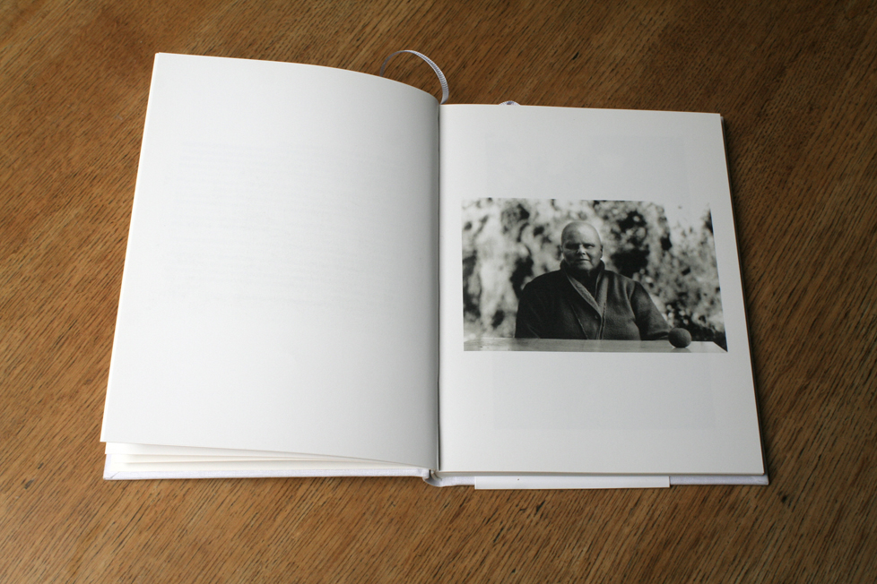
Perhaps my favorite book of Anders Petersen is Ingen har sett allt (Nobody has seen it all) from 1995. It's got his photographs made in a psychiatric home and they start halfway the book. The first half has a text by Göran Odbratt, in Swedish. I can't read it but I am convinced the text is as good as the photographs. One of the reasons why I am convinced about that is how the book was made, the object. Surely there is nothing light about this place, or about the images. And probably there is nothing light about this text. But this book object is totally light: the white cover, the dark blue typography, the spacing of the words on the jacket, the design of the text and the duotone printing: deep and transparent at the same time. Just like Anders.
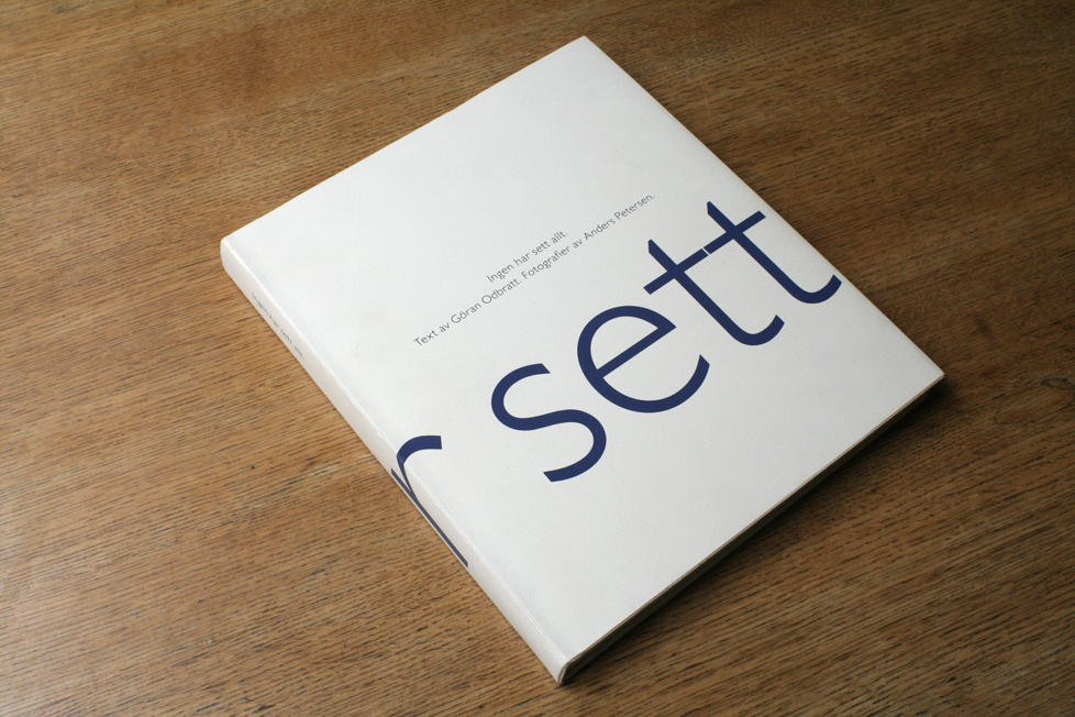
(Anders Petersen: Ingen har sett allt, Legus Förlag 1995) 

Maurizio Cogliandro must have thought along the same lines: Lidia, il cielo cade's cover is white linnen with a small photograph on the front. The layout of the images is very simple, one never feels a designer at work. Also this book breathes a certain lightness. Unusual is what is folded around the back cover: a stiff text band that is fixed together with tape on the inside of the cover. It first looked to me as an irritating invention of the publisher. But I got used it and kind of like it.

Lidia, il cielo cade speaks of the inevitable loneliness we meet when someone we love is dying. It does so in a sober and quiet way, with respect and without anything sentimental. The book is strong when the mother, in her eyes, comments on this son, the photographer. It is one of the first images in the book, she sits at a table, there is an apple lying there. If we assume this is in Rome, then it must be winter. An apple in winter. She has lost her hair and looks at the son with a beautiful intimacy. This image gives direction to the whole book, to the whole idea of the book and it stands out in Italian photography: it is truly personal.

The book is non-linear, with the images are no names, no dates, no places, no chronology. In that way it also stands out: it does not attempt to spoonfeed us what is obvious. After opening the book's cover the lights simply go on, and when we close the book, the lights go off. In between are mother and son, keeping the light on for those around them, and for us. Until we close the book.
 

Lidia, il cielo cade - Lidia, the sky is falling

Published by Edizioni Postcart, in Rome 2010

Photographs and text Maurizio Cogliandro

Design Maurizio Cogliandro and Claudio Corrivetti

English translations by Valentina Nobili

Printed by CDC Arti Grafische

cogliandromaurizio@gmail.com

info@postcart.com


The images of Lidia, il cielo cade are published here with kind permission of both photographer and publisher. The copyright of these images is with the publisher and the photographer - no reproductions without permission. 

Tuesday
Jun122012

Exhibition & Workshop Micamera Milan 

(from a dummy of One Tree, published by Nazraeli Press in 2011)

On the occasion of the exhibition One Tree, opening on 20 september 2012 in Micamera, Milan: 

The photographic bookdummy

workshop with Machiel Botman

21-22-23 September 2012

What is a bookdummy? The bookdummy is the playground for your ideas. What is it for? The object should first serve to teach yourself something. Then you can show it to others, and this will open up the big world. How do you make it? That is first of all between you and you. You have total freedom. The dummy should come to life without pressure. In the end, the dummy is the biggest gift you can give yourself: years later you will love this strange object, because you can see where it worked and where it did not.

This workshop will focus on how to make the many steps into a direction that is right for you. This is about an idea and its content, about editing, about the 'feeling' you want to give the book, about layout. And it is about how to make these dummies: with small fiberprints, or photocopied, or in the computer. What paper to use, how to bind it. We will look at many books and dummies that Machiel will bring.

You come with an open mind and bring anything you would like to include: this can be a small portfolio of a project you have already done and for sure you bring your mess: your unfinished works, small prints or writings or drawings, jpegs and, very important, your ideas. Please remember, even though you can show things on your laptops, it is much better to look at your stuff on the table.

By giving you the "possible-bookdummy-story" of each student, this workshop aims to give you a treasure of ideas to bring home. 


Tuesday
Jun122012

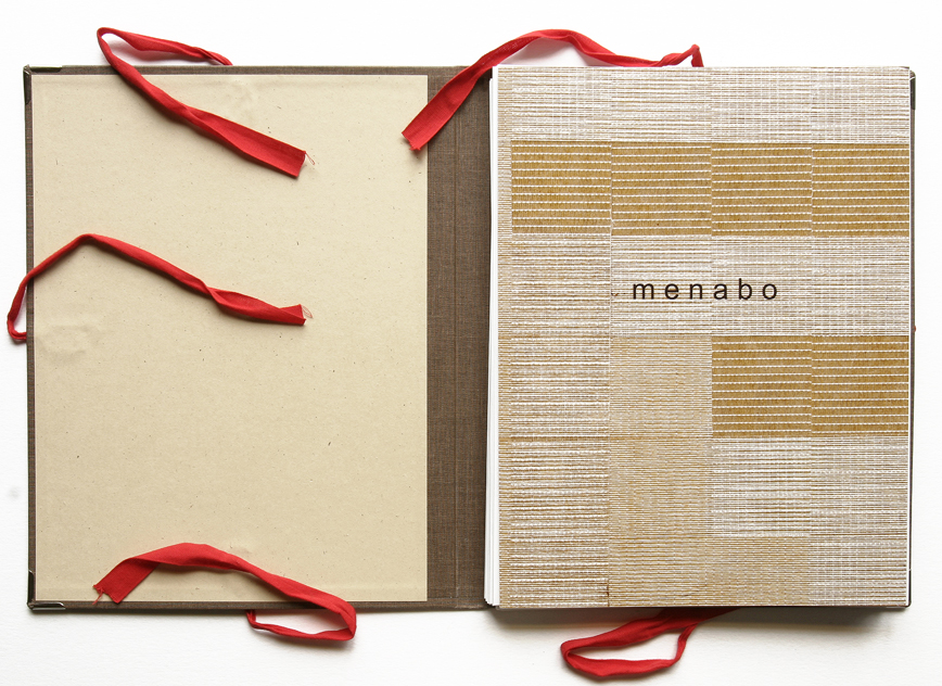
MENABO


MENABO

(catalog published on the occasion of the exhibition with M.R. Gallery in Brescia, Italy, in 2006)

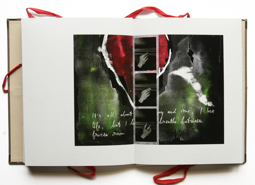
This 36 page Leporello is a hand-folded Lambda print of more than 10 meters, in one piece. Menabo means maquette in Italian, or in this case (book)dummy. I wanted to get away from these "serious' and costly-to-do photography books.

And, like with Drifting, it was another reaction to Rainchild. Perhaps with the aim to be lighter and to play even more. Mauro Rossi is a friend who at that time had his gallery in Brescia. Very kind and crazy man. The perfect accomplice to Menabo.

a small menu card from a restaurant in the mountains of Toscana

a brownish changing skyline of a city

a dummy called Our Fathers, our mothers are from Tokyo

a dummy cover with the image called Frozen Rain

a little man, made by my son from left-over carton strips

a conclusion, that "if I were a bird, I would constantly fly the skylines of our cities"

Menabo

Published by M.R. Gallery, Brescia, Italy in 2006

Edition 200 copies, signed and numbered

Printed by Newlab in Brescia, Italy

Menabo's spreads are published here with the kind permission of Mauro Rossi, the publisher

Copyright images is with the publisher and the photographer 


Thursday
Jun072012

Kiyoshi Suzuki - Soul and Soul 1969 - 1999

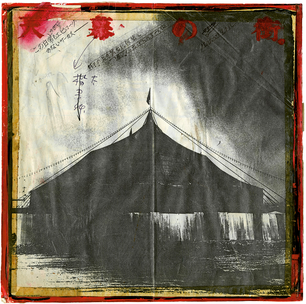
 Photocopied trial cover for Mind Games, 1982

Soul and Soul 1969 - 1999

(published by Noorderlicht on the occasion of Suzuki's retrospective exhibition in 2008)

Kiyoshi Suzuki’s work moved me from the moment I first saw it. From the early 1990s onward I’ve exchanged many photobooks with publisher Kazuhiko Motomura. I sent him every possible photobook from Europe and the U.S., and he sent me Japanese books. One day, a box arrived with all eight books by Kiyoshi Suzuki. I remember taking them out and glancing through them—I felt as if I had entered someone’s private home, where everything I saw spoke to a very personal history which the viewer was invited into, slowly but surely.

The silence in Soul and Soul. The covers of Mind Games and S Street Shuffle. The many layers in Durasia. Many things stood out right away.

Soul and Soul was Suzuki’s first book, published in 1972. It is so beautifully dark and it has remarkable coherence. You wander around inside a highly obscure world and suddenly, the photographer begins to appear from out of nowhere. You sense him, you feel him. It is what the best photography does. Soul and Soul is a masterful first book—the Japanese title Nagare No Uta means Song of Drifting / Song of Floating / Song of Wandering. It belongs in the select company of the simply beautiful first book, like La Banlieue de Paris by Robert Doisneau, A Dialogue with Solitude by Dave Heath, Children of Europe by David Seymour, The Sweet Flypaper of Life by Roy DeCarava, to name a few.

In 1999 I co-curated Noorderlicht's main Festival exhibition, that was called Wonderland. One of the thirty participating photographers was Kiyoshi Suzuki, who I met in Tokyo to discuss selections from Soul and Soul and Mind Games. We spent some hours in the library of Gallery Mole, he was a kind man who liked my selections. A year later I was shocked to hear of his sudden passing.

In 2005/2006 I was planning another visit to Japan, mostly to meet with Miyako Ishiuchi to discuss the possibility of a retrospective exhibition in Langhans Gallery in Prague. Some years before I had become friends with Shin Kajimura, a rare photobook seller in Saitama, in the north of Tokyo. Shin was very much part of this planning and he suggested why not look at Suzuki as well. At the same time Noorderlicht asked me to curate an exhibition for the gallery, things fell into place without much effort.

There was a meeting, somewhere in a high building in Shibuya, with Yoko Suzuki and her daughter Yu, Kazuhiko Motomura and Shin Kajimura. I explained my ideas, which were not very precise and came down to me wanting to see all of Suzuki's work. Where it did become more precise is when I asked if he had many bookdummies for all his books and if they were still there. Yoko had been very quiet until then with a rather concerned expression, but when she heard the word bookdummy her eyes lit up smiling and she said in English: "many, many bookdummies!!". All four of us began to laugh, and I think each one must have thought the same. We were going to be fine.

It took two more trips and many visits to Yokohama, to go through Suzuki's prints, collages, bookdummies and many other things that were part of the workprocess of this photographer. The daughters Yu and Hikari became very involved, so did two former students of Kiyoshi, Isoko and Yuko. During the last visit we moved all the prints and other material to the gallery workspace of Masao Okubo, who so kindly let us work in there for almost a week.

The dummy for Soul and Soul surfaced during the search through Suzuki's estate. It was bound by hand, and much larger than the ultimate book. Suzuki had drawn the cropping for the smaller format of the book as it was ultimately published right into the larger book: a book within a book. One sees here the small beginnings of the great game that he would later be playing; in the knowledge that his later work would become one enormous explosion of book making, one can ask oneself if he was anticipating things. Whatever the case, the dummy is not only an object of great beauty, but in retrospect it is also one of the foundations for Suzuki's way of working. We found this dummy at the very end of that visit, it was so obvious how much seeing this object meant to Yoko. We all make our first book only once, and I am sure this also counts for those who live with the photographer. Glancing through this dummy I knew it held the direction for the exhibition and the book we were going to make. Yoko let me take it with me to Europe, a greater trust could not exist. At the time I lived in Italy, I had that dummy there for almost a year. It became almost a ritual to go through it, sometimes every day of the week and often first thing in the early morning. On many spreads Suzuki had written something. Of course I had no idea what it said. First I thought to scan these notes and ask Shin to translate. But I didn't. Perhaps I wanted to find out how far I would get by just looking at these pages, sometimes comparing with the published book. It was obvious Suzuki was re-interpreting an important part of an episode in his earlier life and I guess he was about 25 years old when doing this. So whatever it was, he was going back into his childhood. The images held nothing linear, he had not made an A to Z story. I could see some of the places were related to mining, but the images and the sequencing made one thing clear: it was not a book about mining. The feeling the images gave me was almost as if he had made these photographs when very young. From the perspective of a 10 to 15 year old boy. But a rather strange boy. I entered a dark, sometimes obscure world that seemed more animation and cartoon than photography as I knew it.

(With photography as I knew it I do not only mean classic photography, like Paul Strand or the likes. Perhaps I mean even more photographers like Moriyama. His first books are from around the same years as Soul and Soul. Also Moriyama is non linear. And some of his early images have a great sensitivity about them. But Moriyama, in Goodbye Photography and A Hunter is a collector of many small moments in passing. It is film and explosive. Suzuki's work is often as obscure and as dark, but it contains a psycological urgency and it has a meditative quality. That surfaces in the images, of course, but it is Suzuki's sequencing that connects the normal 'above ground' life to an under ground life)

Suzuki had gone back to what had fascinated him when he was a young boy. Dark faced men, often nude. Nude for cleaning. Objects that played a role under ground, maybe young Kiyoshi had wondered endlessly about what these dark faced men were meeting under ground. I would have.

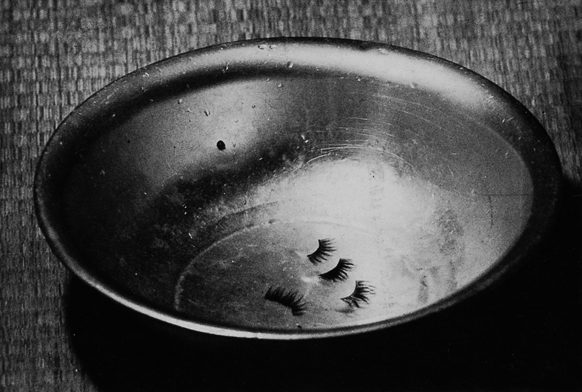
Sometimes the work felt like a family album, with pictures of small brothers and sisters wanting to stand in front of the photographer and his camera. Sometimes there was theater, sometimes there are actors and actresses, but in his sequencing of the images they don't play any performance, they play a part of Kiyoshi's life. He is not only photographing, recording these people, he is also directing them. The book ends with the image of his sister's false eyelashes in a copper bowl, which is also the cover image of the book.

(When Daido Moriyama was installing his 2006 exhibition in Foam in Amsterdam, their director and the curator asked if I wanted to come and meet him. The same day we were sitting in Foam's café, six or seven Japanese and me around a table. Moriyama, through an interpretor, asked me what I was doing in Japan and I told him about Ishiuchi and Suzuki. He smiled and said something Suzuki-san and something else. He was quite exited. The interpretor turned to me and told me she did not understand him. She went to him again and he repeated his words. "The bowl" he is telling me, but I do not know what it means. How could she. But I knew, Moriyama meant the cover image of Soul and Soul. He put his thumb up, saying: "great image". Daido Moriyama later on, when I asked if he could write something in the Noorderlicht catalog, contributed very heartfelt words to this book about Kiyoshi Suzuki).

I wasn’t alone in making the decisions about using the dummy as inspiration for the resulting publication—I first consulted Shin Kajimura. Noorderlicht’s director Ton Broekhuis and curator Wim Melis agreed with the concept of using the photographer’s dummy as a foundation for the book. They suggested designer Hans Miedema. A small group of people helped Hans and me throughout the project: exhibition designers Ype van Gorkum, Marco Wiegers, and Olaf Veenstra and the writer Eddie Marsman. The goal of the catalog was to look and feel like the dummy of Soul and Soul. I also cleared the idea with Suzuki’s family, Yoko, Yu, and Hikari Suzuki, asking permission to reshuffle it a little, so that within the structure of that dummy, we would feature images from each of Suzuki’s other projects. This presents the work in a nonlinear manner, based more on a subjective, personalized vision, which seemed appropriate to the nature of Suzuki’s work. 

The exhibition in the gallery of Noorderlicht opened in march 2008, it was liked a lot. The book came out with it and had the same response. Now, in may 2012, the second edition of Soul and Soul 1969 - 1999 is selling out.

The exhibition was also shown in the House of Photography at the Deichtorhallen, Hamburg in a remarkable presentation: their large central exhibition space was turned into a visual library for Kiyoshi Suzuki's eight books. Each book could be touched and seen by the visitors. Surrounding this central hall, on the outside of its walls, were shown the hundreds of Suzuki's original prints. I have yet to see a more democratic way to exhibit photography books.

In 2010 the National Museum of Modern Art in Tokyo exhibited the work of Kiyoshi Suzuki and published a catalog named Suzuki Kiyoshi: Hundred Steps and Thousand Stories. Also shown in this website.

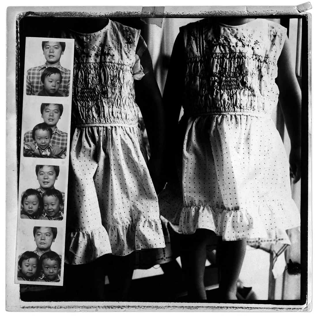
 On the wall of Yoko's livingroom in Yokohama: Kiyoshi and their twin daughters Yu and Hikari 

Kiyoshi Suzuki: Soul and Soul 1969 - 1999

Published by Noorderlicht in 2008 on the occasion of the Suzuki retrospective curated by Machiel Botman

Softcover with illustrated dustjacket, and (secretly) handstamped Japanese title in red ink, visible when removing the dustjacket. 80 pages in full color and black and white offset printing on uncoated paper. Seperate, stapled 14 page text booklet, with two text: The Happiest Moment by Yoko Suzuki and Layer upon layer upon layer by Machiel Botman. Further included is a biography.

Editing: Machiel Botman.

Design: Hans Miedema, with Ype van Gorkum, Marco Wiegers, Wim Melis, Olaf Veenstra and Machiel Botman.

Printed by Tienkamp & Verheij, Groningen

Binding by Patist, Groningen

Published by Aurora Borealis Foundation/Noorderlicht 2008

Acknowledgements: Kazuhiko Motomura, Shin Kajimura, Daido Moriyama, Elisa Uematsu of Taka Ishii Gallery in Tokyo, Magda Giacopini, Isoko Nagaoka, Yuko Ogura and Masao Okubo.

First edition 2008 - 1000 copies

Second edition 2009 - 1000 copies


Images of the work of Kiyoshi Suzuki and images of the spreads from Soul and Soul 1969 - 1999 are shown on this website with the kind permission of Yoko Suzuki and the publisher Noorderlicht.

(copyright for the images of Kiyoshi Suzuki is with Yoko Suzuki, copyright for the images of the spreads of Kiyoshi Suzuki: Soul and Soul 1969 - 1999 is with the publisher Noorderlicht. Use is strictly prohibited without permission)


Friday
Jun012012

DRIFTING

"to be honest, I'm drifting away from many things that are important to me, many people and many things. In a sense I am drifting away from myself, from the life I have. But in another sense this already happened before: where is that boy who photographed himself in the mirror, or the couple in the cinema? Where has that curiosity gone? I am not sure if I want to know the answer, so you tell me, should I want to know?" (from an email exchange with Catherine Duncan).

It was a piece in which I used many unpublished images. Those which had fallen out of the book dummies. It was a collection without sense, because I wasn't consistent: I still brought in known and published images. The wall version of Drifting was liked a lot. It always felt that was because it just looked impressive and perhaps that was reason enough.

"you will do what you have to do, but while you are at it do not forget to use that camera: you have brightened my days with your dark and mysterious images. I insist you keep them coming". (from the same email exchange with Kate)

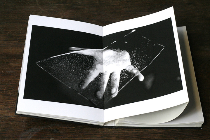
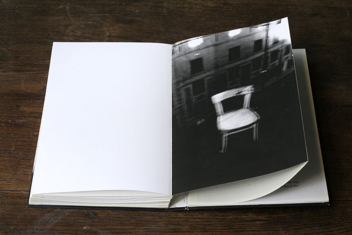
My first exhibition with HUP Gallery in Amsterdam, in 2005, was soon after the Rainchild exhibitions. In fact these were still happening, both with Gallerie Vu and with Grazia Neri. It was not logic to copy these exhibitions, and we decided to show unpublished work. I had just made Rainchild, on which I had worked over ten years. Any next book is (also) a reaction to the book before: I made one dummy for Drifting, one layout, one title, one sequence. That was it. And this time I was consistent: this catalog Drifting had only unpublished images. Hup's young designer found the crazy typography for the cover, which I would have never thought to use, and I loved it. The idea to print the glossy black typography on the dark grey carton of the slip case came from the cover of Masao Yamamoto's beautiful book A Box of Ku, published by Nazraeli Press in 1998.


Drifting

Published by HUP Gallery, Amsterdam in 2005

Softcover in a carton slipcase

Editing and design Machiel Botman

First edition 500 copies, including a limited edition of 25 copies which includes a silverprint of the image Sydney, 1999


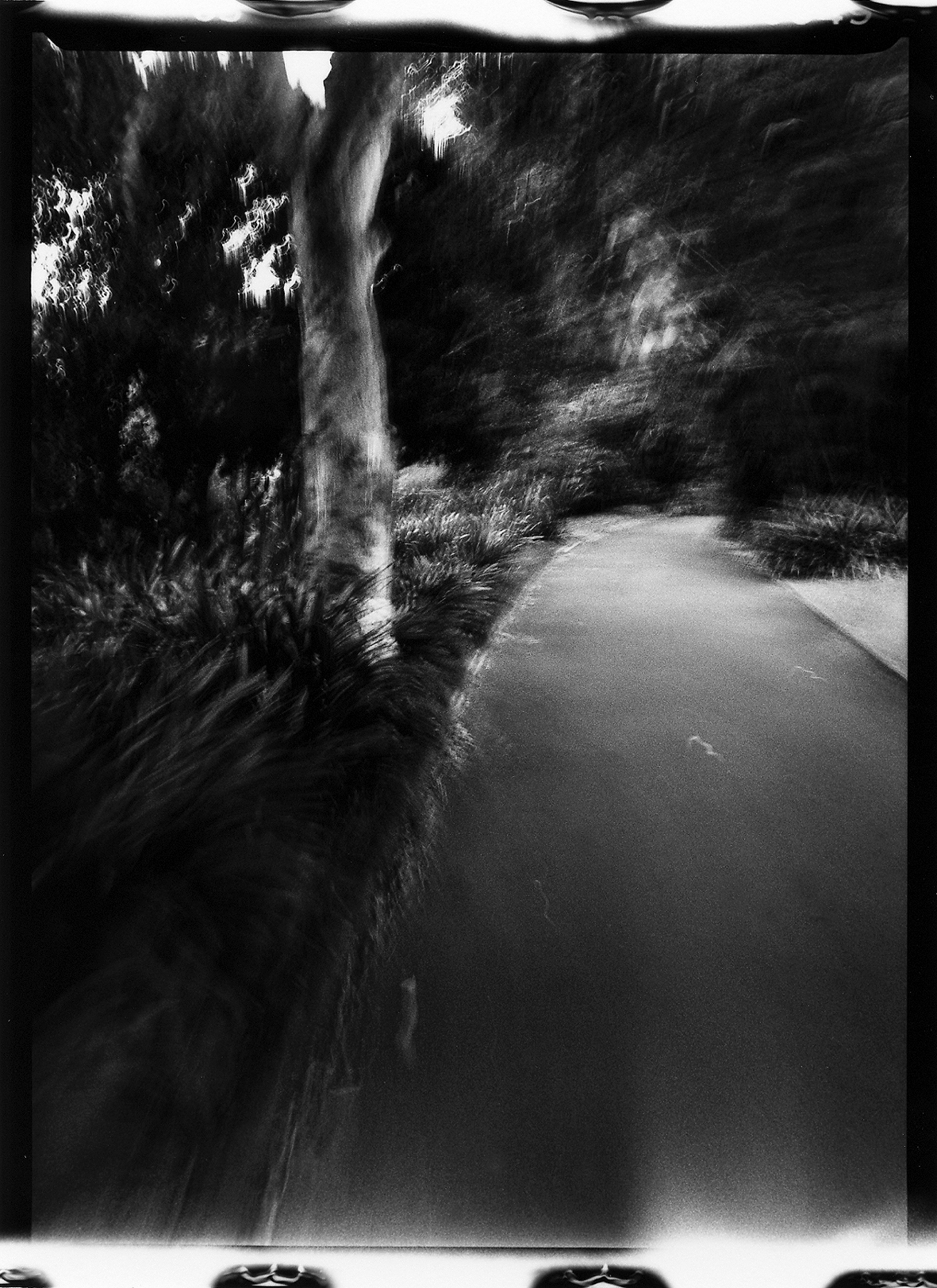
 (Sydney 1999)

Images of the spreads from this catalog Drifting are shown with the kind permission of the publisher

(Copyright for the images in Drifting is with the author. Copyright for the images of the spreads of Drifting is with the publisher Kahmann Gallery (before Hup Gallery) in Amsterdam)